Creating a Welcoming Interior Design for a Multi-Faceted Organization
Arium’s integration of natural light, branding aesthetics, and versatile workspaces into a new office for the Columbia Association helped them better serve their employees and constituents

Executive Summary
For any organization that relocates, it is essential that the interior design of the new space provide an environment that optimizes functionality, employee productivity, and well-being. Columbia Association (CA) presented a unique set of challenges for Arium AE. As a nonprofit management organization, CA is responsible for the financing and maintenance of common-use facilities in the planned neighborhood of Columbia, MD. Their broad range of community services required a dynamic office design that would foster interaction and collaboration between employees in addition to serving and supporting community members’ and organizations’ needs.
Arium not only met CA’s dynamic needs, but went several steps further. The office space was optimized for natural light, configured to encourage increased interaction among employees, and integrated CA’s branding message to reflect the organization’s values throughout.

A Community Organization with a Welcoming and Broad Mission
Columbia, Maryland, is not your typical community, and Columbia Association (CA) is not a typical community association. Columbia’s origins began in 1967, when developer and urban planner James Rouse envisioned a planned community that would integrate innovative ideas in education, recreation, religion, and health care. The end goal was to implement a community that eliminated racial, religious, and class segregation.
While Rouse’s goals may have been ambitious, it’s hard to argue with the results of his vision: Columbia has grown into one of the most prosperous communities in the region, and it is consistently ranked as one of the best places to live in the country.
At the center of this success is the nonprofit CA. CA manages Columbia’s vast array of public amenities, including several pools, recreation centers, before and after school programs, summer camps, golf courses, man-made lakes, and bike trails, as well as 3,500 acres of open space as a permanent asset for its residents. Given this level of responsibility, CA serves as a de-facto governing organization for the community. (Columbia has never been officially incorporated as a town or city).
Despite CA’s community-driven mission, however, their long-running office arrangement was fractured. The IT and Archive teams occupied separate buildings from the rest of the organization, and CA leadership desired to move into a common space that brought all departments closer together. It was essential that the office culture of CA reflected their dedication to community.
“We needed to pull together three groups of employees, so we wanted to create a collaborative environment that would help our team members feel productive and appreciated,” said Susan Krabbe, CA Vice President and CFO.
Upon the recommendation of a real estate agency colleague, CA entrusted Arium AE with the responsibility of helping them locate and design a new office that would fit this vision.
Selecting a space to maximize CA’s outreach
The limitations of CA’s current main office building influenced their decision to consider moving. As with many aging traditional office spaces, their existing space consisted of fully enclosed offices that occupied much of the window line. Cubicles had high panels and the space was compressed by low ceilings. The space provided only minimal access to natural light.
Making matters worse, CA already occupied two floors of their building, and vertical expansion was the only option available to the growing organization. The nature of CA’s work depends heavily on collaboration and so, expanding their footprint across a third floor wasn’t desired.
After an initial meeting with Arium’s Project Manager Madeline Mirecki, Arium and CA reviewed several building options and settled on an ideal location: a rectangular-shaped building south of the Columbia Town Center with a big enough floor plan to keep the majority of CA’s departments on one level.
While the potential layout opportunities were flexible and promising, the building’s infrastructure was aging and would have to be significantly overhauled to meet CA’s needs. In particular, CA wanted an office design that reflected their presence in the Columbia community as stewards of welcoming, versatile, and sustainable spaces for residents.
“We wanted to brand the space to represent CA’s values, and we also wanted it to be environmentally sustainable because that’s important to our mission,” said Krabbe.
Given these needs, the Arium team started developing a design that would incorporate current trends and best practices while creating a versatile and welcoming work environment for everyone.
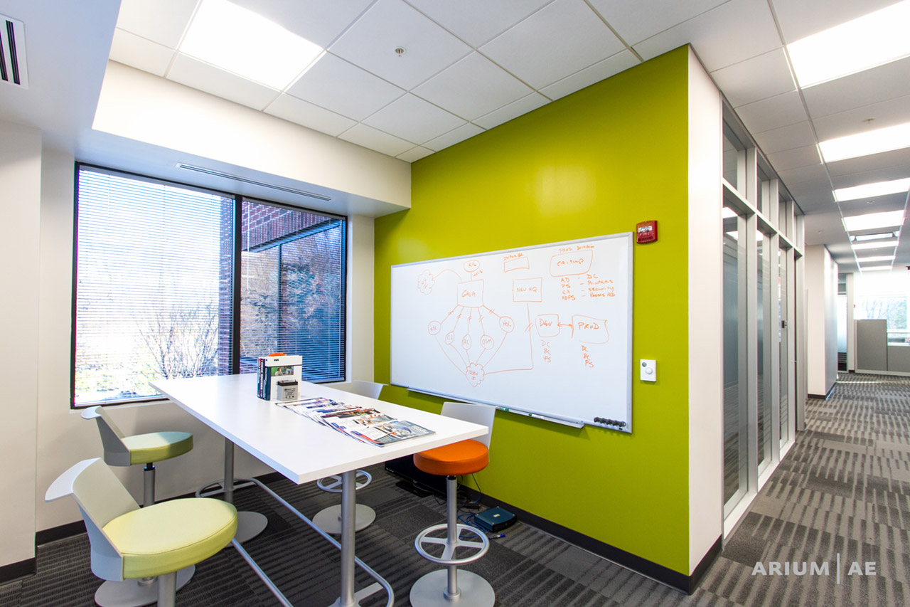
“CA needed a mix of open collaborative spaces and traditional private office spaces,” said Mirecki. “While full-on open office and shared workspace is currently a trend, CA wouldn’t have been satisfied with the extreme. They work with a lot of individuals in the community, so they needed breakout areas where people could get together without formally scheduling a dedicated conference room. We paired these breakout areas with traditional conference rooms and cubicles to meet the organization’s specific needs.”
Incorporating Interior Design Trends to Create a Welcoming Environment
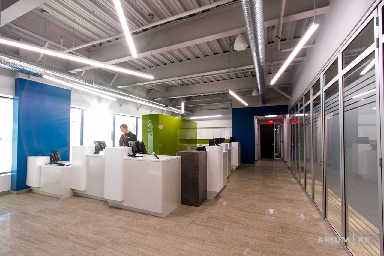
The most striking feature of the new CA space is the way natural light penetrates the entire space. Incorporating natural light, or what Fast Company refers to as “bringing the outdoors in,” allows for greater employee comfort and is an essential part of many current office design trends.
Arium optimized the floor plan to ensure that light would travel into the core of the building. Most of the offices are located on the interior, and workstations are situated on the perimeter and window line. The workstation panels parallel to the window were kept low to allow light to flow into the center of the floor. Interior offices took advantage of the natural light by utilizing glass front walls and aluminum framing that stretched from floor to ceiling. With this setup, office occupants could maintain a level of acoustical privacy and have access to daylight as well.
“Both employees and employers benefit from more exposure to natural light. Research shows that employees become more productive and it improves overall morale,” said Mirecki.
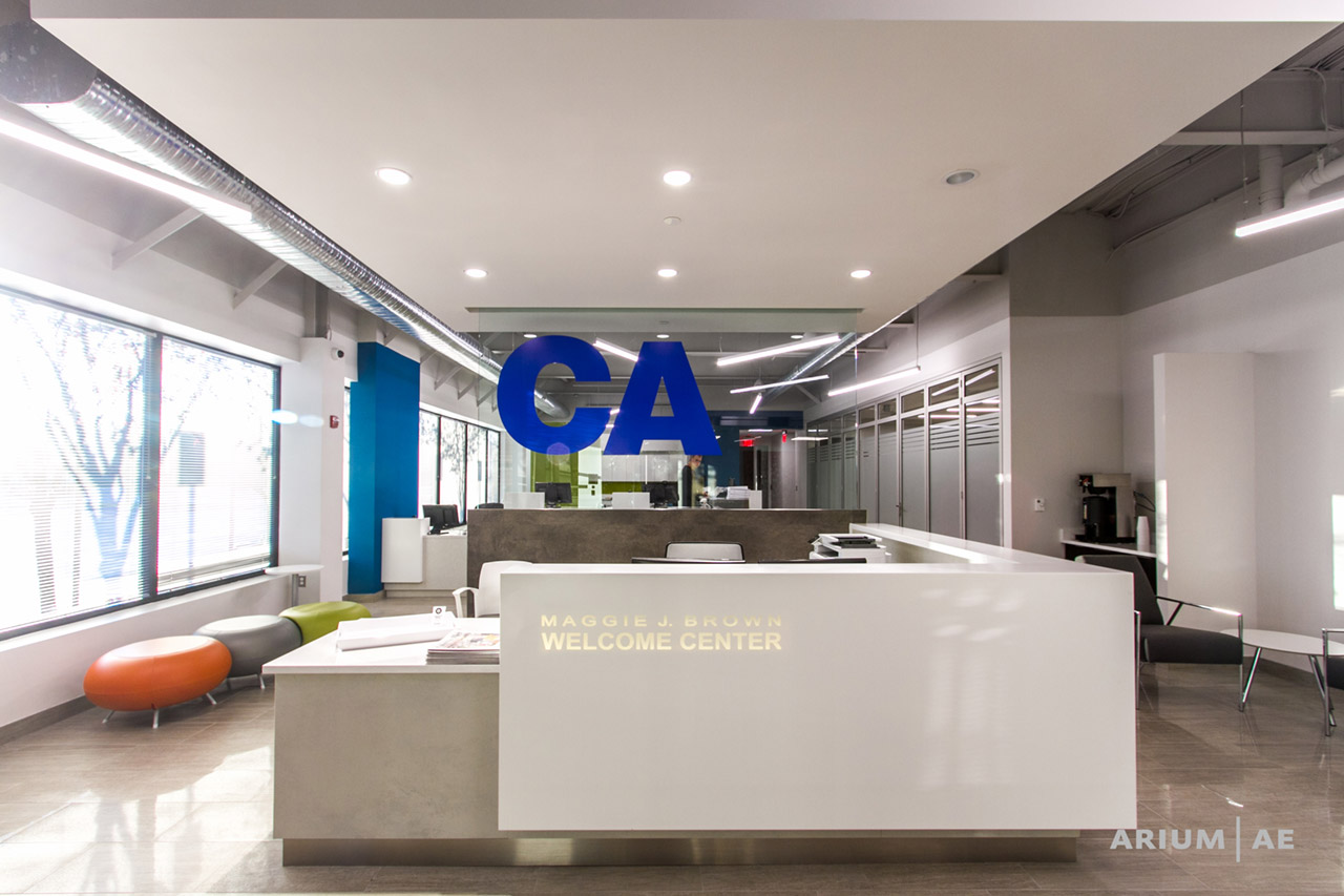
The use of color also played a critical role in the office layout. The Arium design team implemented clean lines and neutral backgrounds on the carpet and walls as a clean foundation to add pops of color throughout the space. CA’s branding colors of blue, green, and orange were incorporated throughout the space.
The CA design team also provided Arium with an array of their print materials to show how they utilize white space, the types of fonts they use, how they arrange photos, etc. As a result, the new space is a deep reflection of CA’s entire branding aesthetic and their commitment to staying relevant and modern.
“Branding should carry into your workspace and not be limited to your letterheads, business cards, and marketing materials,” said Mirecki.
The branding color pops also had a secondary purpose of helping visitors and employees with wayfinding. The conference rooms are marked by orange splashes that run through the floor and up the wall. The kitchen includes CA’s primary colors of blue and green.
“Arium did an excellent job branding the space – from where the departments should be located and how open areas should be utilized, to the color application. The space has a lot of energy and it’s inspiring.”
In addition to maximizing natural light and color, Arium team members took CA leaders on a trip to a living lab in Baltimore to view some of the latest designs in ergonomic office furniture and help them settle on a selection that was both comfortable and affordable. CA decided to implement sit-to-stand desks, giving their employees the flexibility to choose the most comfortable position for them.
Serving Internal and External Communities
The impact of Arium’s design is readily apparent upon entering the building. Natural light floods into CA’s Welcome Center – which includes the Member Services area – and chairs are colored with the blue, green, and orange of CA’s branding palette. Subtle design flourishes make the Welcome Center more open and accommodating to visitors. Lowered fronts on the cashier desks allow members to be face-to-face with member services reps.
To the right of Members Services is a large board room and adjacent conference room that are available for community organizations to use for meetings. Movable partitions increase flexibility of the space by allowing the two rooms to open up and be used as one. A folding glass NanaWall system also provides the option for these conference rooms to open up to the Welcome Center and lobby for even larger gatherings and events.

While much of the design effort focused on serving the needs of community members through the Welcome Center and adjacent conference rooms, the space needed to foster a sense of an internal community as well. Arium made a considerable effort to maximize the efficiency of the space and bring all departments closer in proximity to each other. For example, there are a number of informal lounge areas, huddle rooms, and traditional conference spaces available for meetings. CA’s camp administrators regularly use these spaces to discuss and plan events throughout the year.
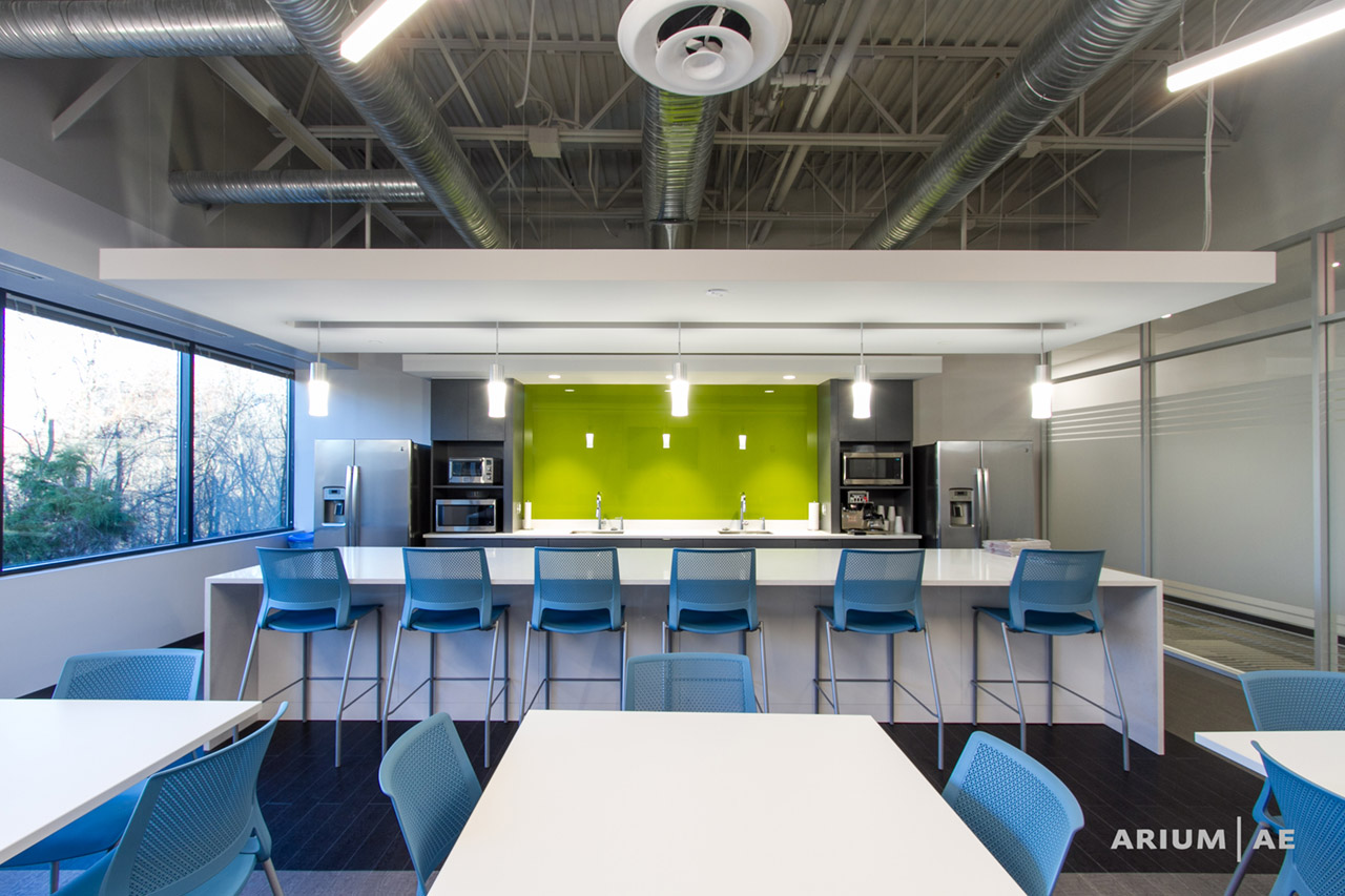
CA’s previous office space included separate formal break areas scattered throughout. The new design features casual community spaces, which encourage interdepartmental gatherings. A central break room is an expansive, sun-filled space that includes a large break area, communal bar, and several tables. It is meant to serve as an open area for gathering and informal conversation, not just for eating.
“Co-workers can get together, relax, and exchange thoughts and ideas, which leads to increased productivity,” said Mirecki, “CA is about the Columbia community – these break out spaces build their corporate community.”

Although these types of break rooms are trending, it’s often difficult to predict whether employees will actually use them. Fortunately, it’s already proven to be a popular location for the entire office:
“Our staff commented that they interact with other departments more than they ever had before, and they’re now using the space for casual meetings.”
Creating A Space That Reflects the Organization
Ultimately, Arium and CA’s intentions were to create a space reflective of CA’s values. CA is responsible for fostering a welcoming community in Columbia and for maintaining its beauty and environmental sustainability. The new office space, with its natural light, tasteful use of color, and its versatile community spaces, reflects the same qualities that people associate with CA services.
“Everybody that comes to visit remarks on how beautiful it looks,” said Krabbe.
for more information on this project, or to discuss your particular project needs, please contact Brian Frels at brianf@ariumae.com or 410.730.2300.
 Download a PDF of this article by clicking here.